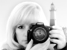
(The last 2 are very similar, only one has a tiny border, in case you didn't notice.)
Please look closely, I need your honest opinion. If there is one thing about one that you like & would like to see it in another one, say it, I can redo anyone. I see everyone likes #2, is it only because if the name? Remember it's the heading only, my photos will be displayed right on the same page. Noe other pages for now, just keeping it simple. I will have to work off my boys' computer. AOL's Easy Designer is not compatible with MACs.
Thanks for all who have commented, really appreciate it.
Also AOL is screwing up on the postings & comments, it may appear that your comments are not posting, but they are & sometimes twice. Report it to Jeff @ Magic Smoke.

8 comments:
Marie...this is a tough question! I like them all, actually, but here's the order in which I like them: first favorite is #1. I know the photo in it is small, but that's what the space is for...you'll fill the site with tons of great images! 2nd favorite is #3. Actually, I don't really like 2 and 4 as much because of the borders. I like the way 1 and 3 blend into the background without a cut-off. My only problem with #3 is that you've left out the words "Photographs & Memories". I think if you add that back in, #3 would be my favorite. Too much, huh? Sorry...this is my streamofconsciousness answer for you. :)
~Vicki
i believe i like #2 the best. i definitely think you want to keep the caption 'photographs & memories'
gina
I love 'em all... but it's gotta be number 2
hugs
d
Number 2 is probably my favorite, but I really like the idea behind the first one. Maybe if you filled in the other frames with some pictures. Possibly alternating the self portrait and another portrait. The last two has too much blur in the baby portrait, and since it is so prominant, it needs to be crisp as in the second one.
If you get it figured out in the next few days, I'll put it at the top of the article I will be writing about you.
Greg
http://journals.aol.com/radar446/PhotoTrek/
Marie #2 hands down!!! Let me know when you launch!!!
Betty
I still say number 2. I love the pictures and the blur effect, but not so blurred. I also love the full name on it :)
hugs
d
I've been trying to leave this comment for 2 days! lol I like number 1, I think it's sleek and crisp and looks professional. Hugs and GBU, shelly
Yeah, if it's not too late, lol, I like #2
Post a Comment